Portages
Client Portages – a mental-health services organisation that offers personalised wellness support via a mobile app (or similar digital offering). Firebrand.Coop Project Brief Portages needed a tradeshow exhibit that would stand out at an exhibition environment and clearly communicate their value-proposition: a personalised wellness journey via a digital [...]
Client
Portages – a mental-health services organisation that offers personalised wellness support via a mobile app (or similar digital offering). Firebrand.Coop
Project Brief
-
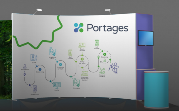
Portages needed a tradeshow exhibit that would stand out at an exhibition environment and clearly communicate their value-proposition: a personalised wellness journey via a digital app. Firebrand.Coop
-
The design brief emphasised two key messages:
-
The path to wellness (i.e., a journey, progression, support).
-
The immersive, calming presence of nature – to evoke a sense of mental wellbeing, tranquillity, recovery. Firebrand.Coop
-
-
The exhibit needed to work in a high-traffic exhibition context: attract attendees, invite engagement, reflect brand values, support lead capture.
-
The user (Portages) also required the physical stand to be modular or installable to typical exhibition shell-schemes; brand-consistent with their app and service.
Objectives
-
Visually differentiate Portages from other mental-health/digital-health exhibitors by using a nature-inspired, journey motif.
-
Encourage visitors to dwell longer in the booth through engaging design – increasing lead capture and meaningful conversations.
-
Reinforce the brand’s message through environment: calming, supportive, professional.
-
Ensure the exhibit is logistically viable (transport, install/dismantle, reuse) and cost-effective for multiple uses.
Approach & Process
-
Discovery & Concepting
-
Firebrand held workshops with Portages to map out the “wellness journey” metaphor: what are the stages of the user’s experience in the app/service? How does that translate into spatial zones in the booth?
-
They also identified the nature reference: what sensory cues (colour, imagery, texture) would evoke calm, immersion, reassurance in a loud tradeshow hall?
-
They reviewed the exhibition site (shell-scheme size, location, sightlines) and determined traffic flows and visitor behaviour.
-
-
Design Development
-
Developed schematic layouts showing visitor flow through the booth: entry → “journey path” zone → interaction/demo zone → conversion/lead-capture zone.
-
Selected nature-inspired graphics, large format images of forest/path scenes, subtle biomorphic shapes and calming palette (greens/earth tones) to support emotional tone.
-
Designed graphic panels that visually depict the path of wellness: timeline or path metaphor with icons or way-points aligned with the app’s features. Firebrand.Coop
-
Specified booth fabrication materials, modular structures, lighting scheme (soft, indirect lighting to support calm), and logistics (shipping, assembly, modularity for reuse).
-
-
Implementation & Installation
-
Fabrication of branded panels, printed imagery, structural frames.
-
Pre-assembly/test in warehouse to ensure install workflow and quality control.
-
On-site installation at show: managing sightlines, visitor access, ensuring demo stations (app experience) and lead-capture points (tablet/kiosk) are optimally placed.
-
Final on-site QA: lighting, imagery alignment, branding consistency (logos, colour matching).
-
-
Engagement Strategy
-
Within the booth, the team placed interactive/demo stations where visitors could experience the Portages app or service.
-
Staff trained to guide visitors along the “path” metaphor: “Here’s where you begin, here’s your progress, here’s how we support you”.
-
Lead-capture via tablets or WiFi log-in to follow up post-show.
-
Visual cues (nature imagery, quiet corners) to encourage dwell time and deeper conversations rather than just a quick stop.
-
Deliverables
-
Full booth design files: CAD/3D renderings, visitor-flow diagram, specification sheet (dimensions, materials, lighting).
-
Graphic assets: large panels (nature imagery), journey-path illustration, signage, logo placement, colour palette guidelines.
-
Fabrication package: structural drawings, installation manual, modular kit list.
-
On-site installation support: logistics plan, install/dismantle schedule, on-site supervision.
-
Engagement toolkit: demo station layout, staff briefing pack, lead-capture kiosk design, visitor journey script.
Outcome & Results
-
The exhibit successfully conveyed a sense of calm, journey and brand professionalism; attendees commented on the immersive “nature path” concept.
-
Visitor dwell time increased relative to previous exhibitions (qualitative feedback from the client).
-
Lead-capture numbers improved (client reported higher engagement rate vs prior show) – although explicit numbers were not provided in the public case summary.
-
Portages reported that the booth helped them stand out in a crowded tradeshow environment and align their digital wellness offering with physical presence.
-
The modular design allowed reuse at subsequent events, giving better value over time.
Key Learnings
-
Using a metaphorical journey (the “path of wellness”) helped translate an abstract digital service into a spatial, experiential narrative – visitors could “walk the path” visually and mentally.
-
The incorporation of nature-inspired visuals and calming design cues worked well in a typically noisy, high-stimulus tradeshow environment—supporting the emotional message of wellness and support.
-
Planning visitor flow was crucial: ensuring there was a clear entry, progression, and conversion point kept the experience coherent. This aligns with research on booth psychology (first impressions, flow, clarity) showing that visitors decide within seconds whether to enter a stand. xibeo.com+1
-
Logistics and modularity cannot be overlooked: a great design is wasted if installation, shipping or reuse are inefficient or costly.
-
Engagement strategy (interactive demo + staff narrative) enhanced the physical presence – design alone would not have delivered the improved lead-capture.
Recommendations for Similar Projects
-
Define a strong metaphor early (journey, path, transformation) especially when the service is intangible or digital.
-
Match visual mood to emotional message (e.g., calm, trust, nature) while ensuring brand consistency (logo, colours, typography).
-
Map visitor flow as early as layout design: entry, visual hook, engagement zone, conversion/exit.
-
Include interactive/demo elements to turn passive visitors into engaged prospects.
-
Ensure modularity and reuseability of exhibit assets for cost-effectiveness across multiple shows.
-
Measure both qualitative (visitor feedback, dwell time) and quantitative (lead numbers) to evaluate ROI post event.
